EYC ACADEMY WEBSITE REDESIGN
UX DESIGNER / EDTECH / PRESENT

Role
UX Designer
Teams
Team Lead (Jossi Ghafuri)
UX Design
UX Research
UI Design
Development
Marketing
SKILLS
Information Architecture
Sitemaps
Wireframing
Copywriting
UX Writing
Design Systems
Prototyping
Tree Tests
Card Sort Tests
Content Audit
Literature Review
TOOLS
Figma
Optimal Workshop
Google Docs
Chat GPT
Otter
Discord
Timeline
Oct 2023 - Present
ROLE & IMPACT
40 million people
ages 25+ years and older in the U.S. do not have a high school credential, according to the 2020 U.S. Census
$250,000
is the difference between the lifetime earnings of a high school graduate versus a non-high school graduate, according to All4Ed
98% students
of students drop out of the 10th grade or beginning of 11th grade due to fear of failure, no support, and lack of applicability, according to a 2006 research from the Gates Foundation
As a UX Designer for UX Foundations, a remote global collective of 2,000+ UX designers that produces user-centered solutions, I’ve redesigned a website for Tammy Noel of EYC Academy to streamline how users enroll, learn more about the school, and navigate its site. I’ve worked with a UX design partner, team lead, and 5 other members across cross-functional teams to do so.
By refining the site’s user experience, we aim to expand awareness around personalized, flexible school resources for those with special needs and adult nontraditional students. Creating recognition for this school will open opportunities for students to achieve their academic and non-academic goals, no matter where they are located, their schedule, their past or hardships, or their special needs.
This has been my longest running and most complex UX project I’ve ever worked on, but I’m grateful for the growth I’ve experienced so far in grasping new strategies and tools, collaborating with and managing stakeholders, and juggling multiple roles due to team reorganization!
*This project is ongoing, so this case study will be updated accordingly.
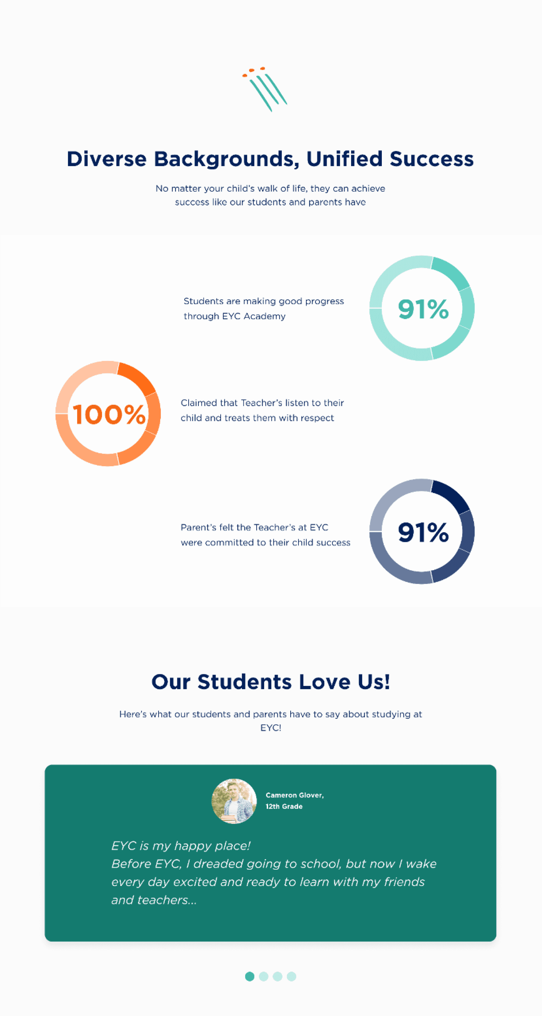
OUR WINS SO FAR

20+ pages
were reduced from the website by optimizing the information architecture (IA) and consolidating content, resulting in a more efficient navigation experience
77% participants
on average succeeded in our tree test tasks when evaluating our new IA, which confirms that finding information largely meets users’ expectations
PREVIEW

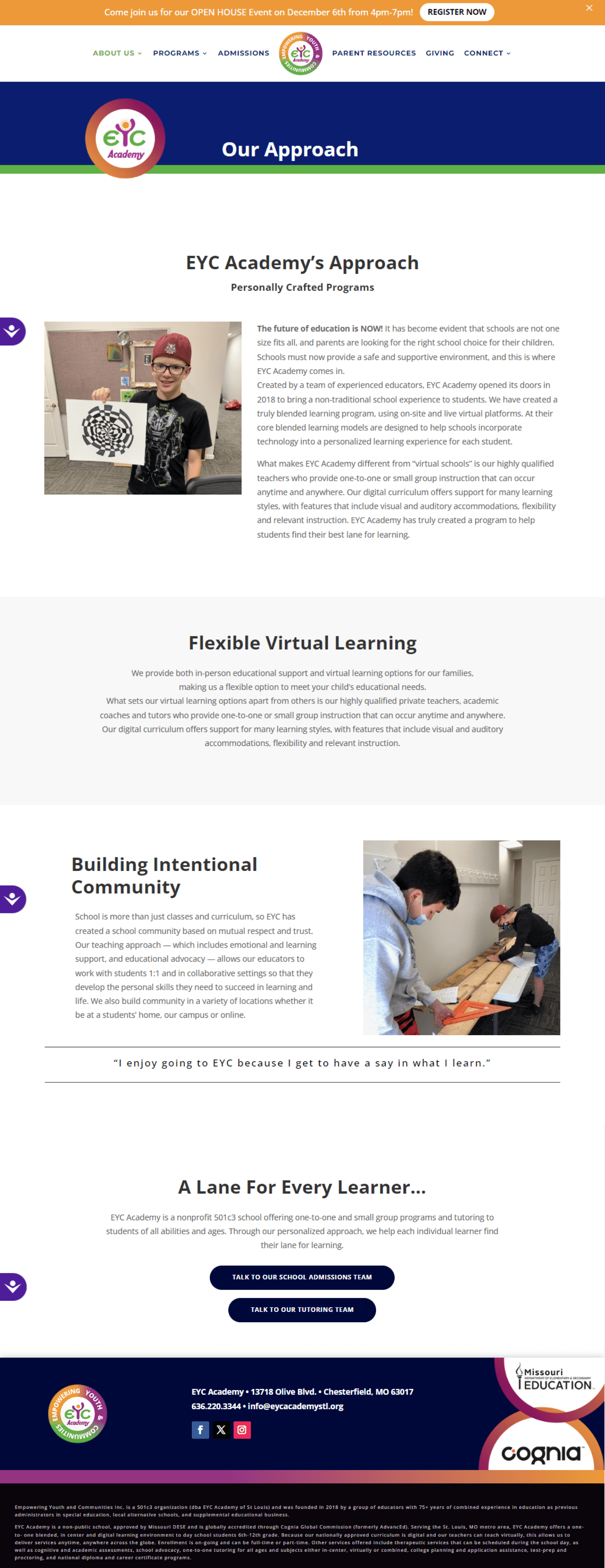

Current Progress


BACKGROUND
Parents struggle to find alternative schools that accommodate their child’s unique needs
Imagine having a child with special needs, but their school consistently overlooks them. Now, imagine searching endlessly for an alternative school, but with no luck. Frustrating and draining, isn't it?
Per the Research Team, many parents of 6th-12th graders face this reality. This often leads to learning gaps, difficulties with social belonging from jumping between schools, academic setbacks, and dropouts.
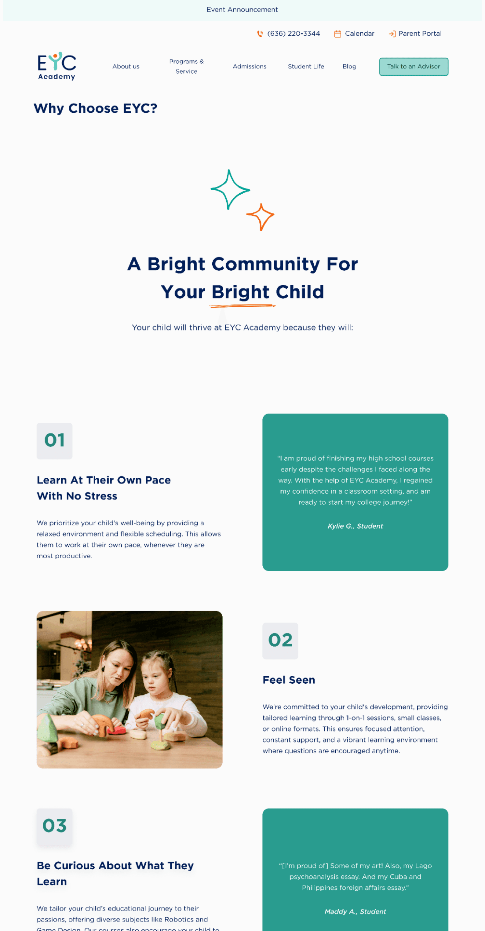
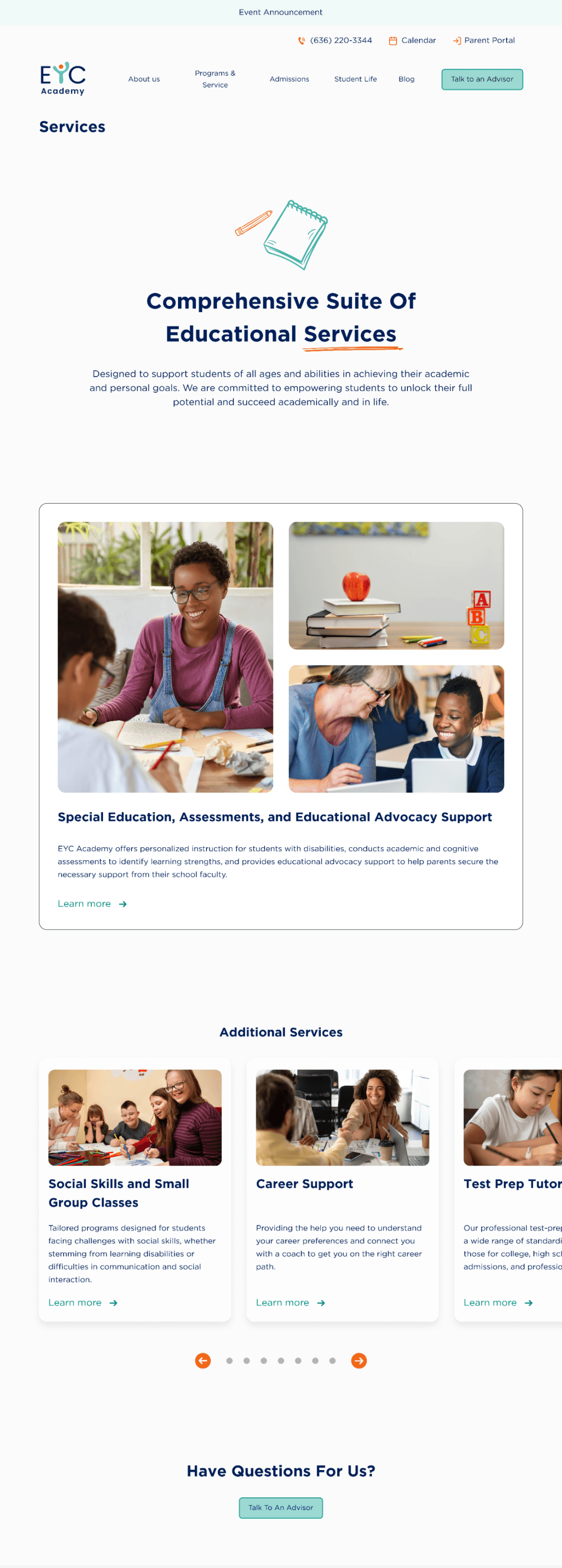
Enter the picture: EYC Academy, a personalized, flexible alternative school
EYC Academy is a non-public school in St. Louis, MO with local, national, and global accreditation. With 75+ years of combined educational experience, its vibrant community offers 400+ diverse courses catering to various academic backgrounds.
On one hand, EYC Academy is a good alternative school because they:
Offer diverse programs and services to help students achieve their version of academic success at their own pace whether they are in 6th-12th grade or are a nontraditional student
Provide holistic support in areas such as learning disabilities, mental health, and socio-emotional skills
Eliminate stigma around alternative education
But there is one big problem...
PROBLEM
Navigating the current EYC Academy website is confusing, overwhelming, and disorganized, which obstructs users’ understanding of the school and deters enrollment and support.

SOLUTION
Streamline the website’s navigation, revamp the design appeal, and establish a clearer, appropriate brand voice to enrollment and supporters, build community, and help further eliminate stigma around special learning needs.
TREE AND CARD SORT TESTs
Our new IA aligned with users...somewhat!
We then wanted to validate if our new IA meets users’ expectations on where to find crucial information that helps target users decide whether to enroll or donate. So, us designers supported the Research Team in crafting tree and hybrid card sort tests* using Optimal Workshop.
Overall, our new IA aligned with users’ expectations! However, there was still some misalignment that we didn’t anticipate.
INFORMATION ARCHITECTURe
Creating a more condensed, intuitive navigation
Making it more intuitive for our target users to find the information they need to learn about the school and how EYC might benefit their children increases confidence among parents, and assures a higher likelihood of enrolling.
That’s why to kick things off, we refined the navigation. After consolidating, renaming, and recategorizing pages, we drew up a 2-part IA in Figjam that better prioritized content catered to our primary target users, potential EYC parents of 6th-12 graders.
Original IA

New IA Iteration #1

TREE AND CARD SORT TESTs
Our new IA aligned with users...somewhat!
We then wanted to validate if our new IA meets users’ expectations on where to find crucial information that helps target users decide whether to enroll or donate. So, us designers supported the Research Team in crafting tree and hybrid card sort tests* using Optimal Workshop.
Overall, our new IA aligned with users’ expectations! However, there was still some misalignment that we didn’t anticipate.
TREE TEST HIGHLIGHTS
32
participants (7 abandoned)
77%
tasks on average were a success
72%
tasks on average were a success with no backtracking
“Our Approach” is where people tend to go to learn more about the school
84% participants expected to learn about EYC and their learning approach, mission, and values on this page, which aligned with our expectations!
People aren’t sure what counts as a “Program” and a “Service”
Participants backtracked considerably between “Programs” and “Services” to find information about the adult high school diploma education program and support service for children with learning disabilities.
People had difficulty finding the “Spirit Wear Store”
While a majority of participants correctly navigated to the “Community” tab to find the store, some commented that its location wasn’t “explicit enough,” and even 24% first clicked on “Programs and Services.”
CARD SORT TEST HIGHLIGHTS
22
participants (5 abandoned)
71%
participants at minimum organized over half of the pages as intended
“...Some of these things I would expect to see on buttons on the home (schedule an appointment, for example) and not buried in a list where I would have to look for them.”
— Participant
“I had a bit more difficulty with…’Programs’ or ‘Services.’ I didn’t know much about what those entailed, so I felt like I could put [the relevant pages] in either and it would be okay.”
— Participant
*How We Could Have Improved Our Test Design
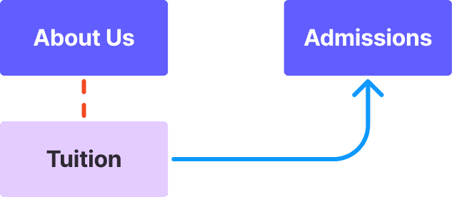
Due to the technical limitations of Optimal Workshop, we could not create more nested pathways. More nested pathways would have made it clear that there were programs catered to different age cohorts, including adult nontraditional students. This made tasks like finding adult high school diploma programs difficult, where 24% participants navigated to high school programs meant for students grades 6-12. To alleviate this, we could have renamed the page in the time being to reflect this specification (ex. “Adults’ National Diploma”).
“Finding how EYC supports students with learning disabilities” is a broad task that leads to multiple plausible pathways: users could learn about this in “Our Approach,” or read about their “Learning Disabilities Assessments.” We could have specified this scenario to improve the direct success score, for example, by asking where they would go to get their child consulted for learning disabilities.
IA TREES #2
Iterating on the IA for more user-aligned organization and succinct, emotionally impactful copy
Using the tree and card sort test insights, we improved the IA.
While there were other major data-driven changes we considered, we moved onto content auditing in the meantime, since this would also influence the organization of our IA.
With that, our changes were on a smaller scale, focusing more on rebranding the copy and reorganizing pages.
HOW WE IMPROVED THE iA
Evoked more community and emotional appeal

More community-oriented titles better paint EYC in a compelling light and establish their value of kinship
Reorganized pages based on research
Relocated pages to navigation categories that aligned with users’ expectations based on card sort tests
CONTENT AUDIT
EYC Academy’s content is neither scannable nor readable
We then dove into content auditing, assessing content for clarity, scannability, and relevance, then decided whether to keep, reword, relocate, or remove content for better storytelling of EYC’s unique values and offerings.
We found that many pages had strived toward text hierarchy and impactful messaging, but these areas could still be improved. Many pages were cluttered with large text blocks and had inconsistent visual design.
REsearch Review
Similar websites are transparent, easy to navigate, and consistent in visuals and messaging, which creates effective storytelling
Through a competitive analysis on similar websites*, the Research Team largely found that similar sites were transparent about their offerings and processes, easy to navigate, and consistent in visual design. They also showed effective visual storytelling through elements like layouts that follow natural reading patterns and balance between images and text.
This information helped us later iterate on a scannable, intuitive reading experience, and gain insight into what makes the design of other alternative school sites effective and how EYC’s site could be improved.
*Keystone School, Fusion Academy, Pearson Academy, Proximity Learning, and Yellow Wood Academy
LO-FI WIREFRAMES
Brainstorming better visual storytelling based on research
Finally, after reviewing the Research Team’s insights, auditing content, and improving the IA, we moved onto ideation!
We prioritized ideating for desktop since, according to the Research Team’s Google Analytics insights, 75% of the site’s users use desktop interfaces.
CHALLENGE
Deciding how to design the navigation bar (of a 30+ page website!)
We struggled with refining the categories of the navigation bar to be specific and minimal in amount, but also encompass different kinds of pages. We questioned constantly about whether the amount we had was too much, or if certain pages should be relocated. We wanted to make sure users could easily find what they needed and not feel overwhelmed!
OUR APPROACH
Remember your target users, iterate, and don’t forget about the footer!
My partner Abril and I experimented with different iterations that we thought best mimicked our IA tree and resolved this issue.
The turning point was when our team lead reminded us that we were designing primarily for parents of 6th-12th grade students. This led us to spotlight pages they would want to see in the navigation bar, then relocate pages for secondary users, like donors, to navigation components of less visual hierarchy, like the footer.
This taught me to think flexibly about how to organize navigation systems, and reminded me that UX design isn’t always a linear process; we had to go back to change our IA tree concurrently multiple times to reflect our navigation changes!
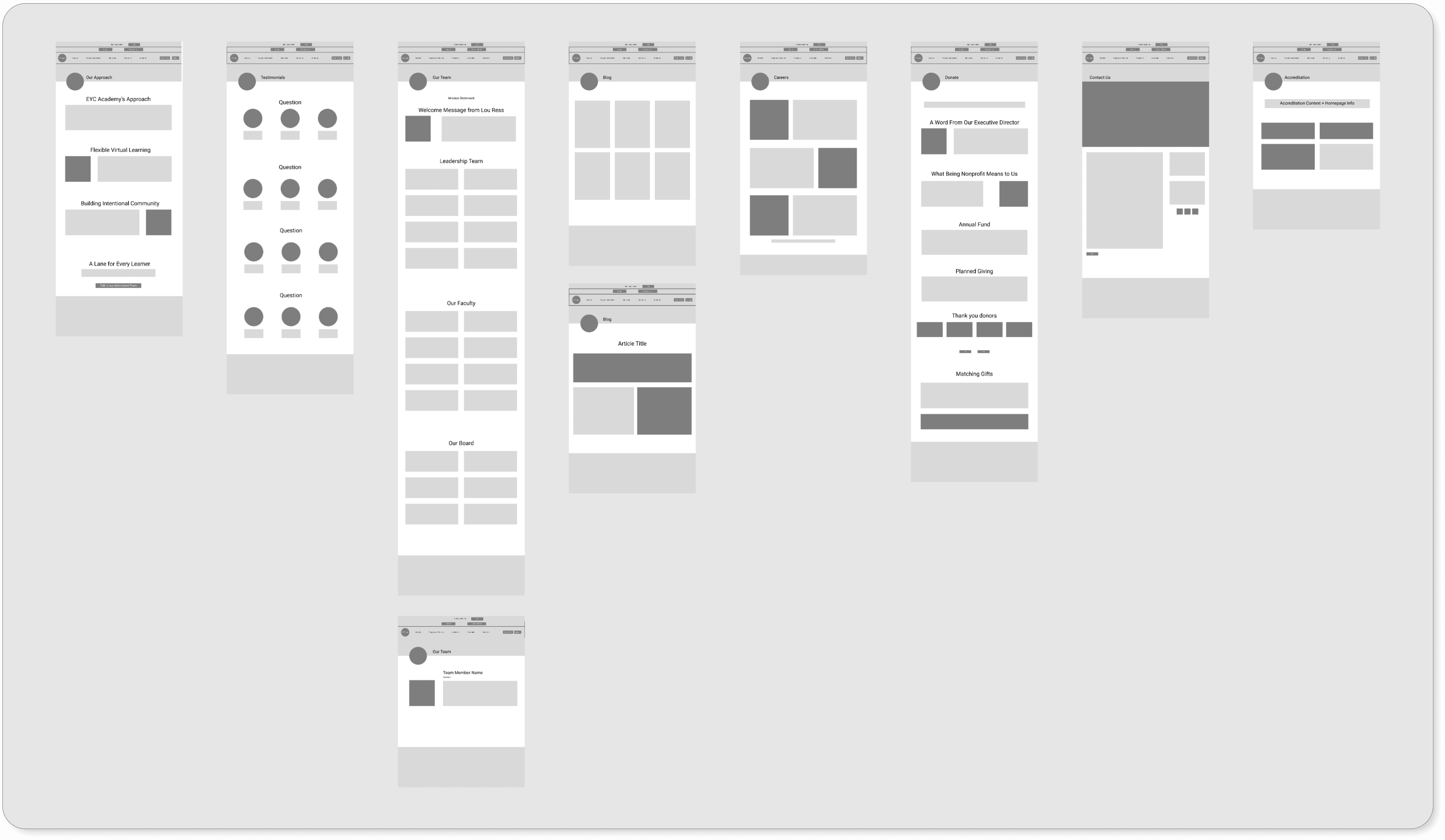
Nav Bar Iteration #6

Nav Bar Iteration #14
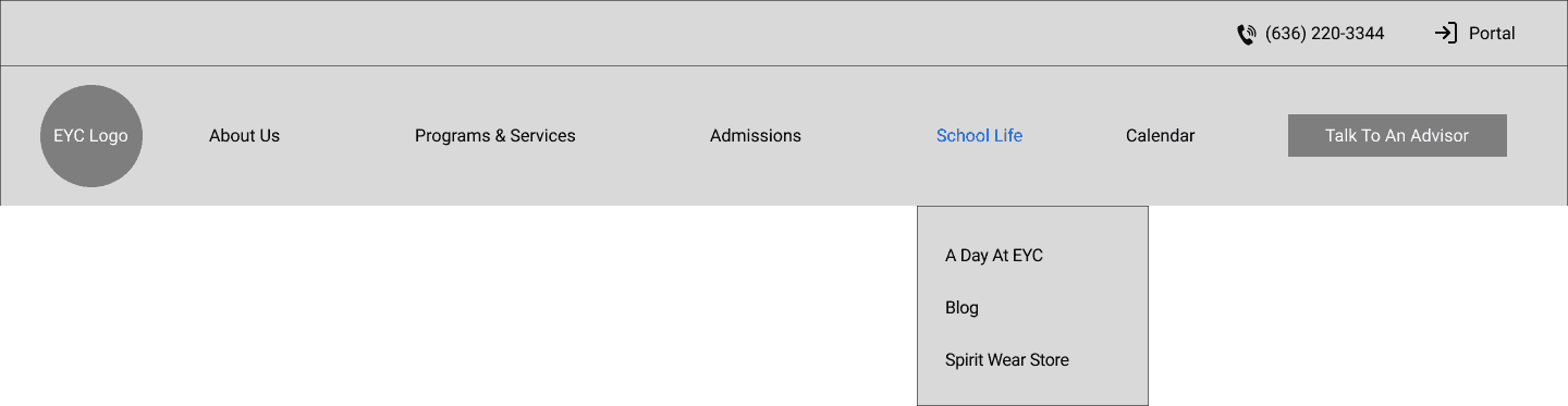
Final Nav Bar Iteration #18

Final Footer Iteration #4
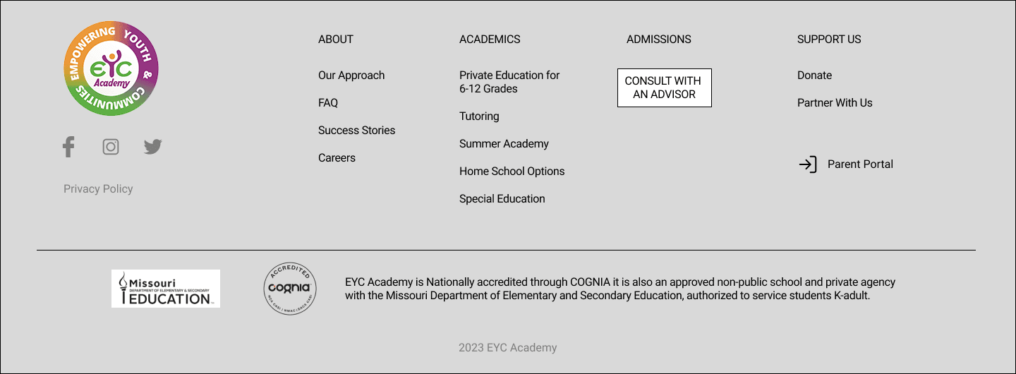
Final IA Iteration #9

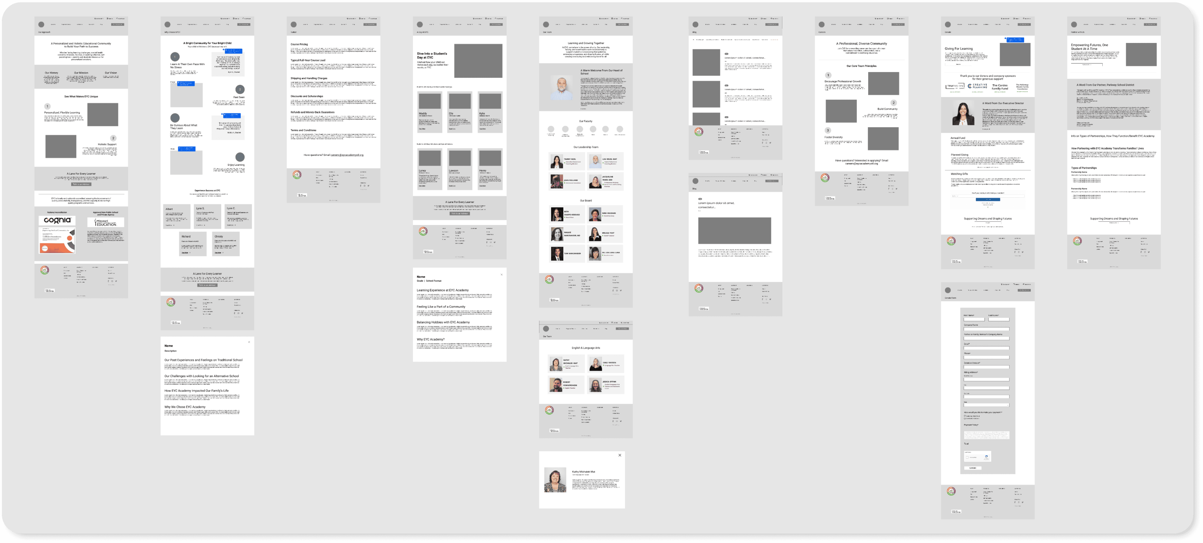
MID-FI WIREFRAMES
Refining!
After creating a basis for our page layouts, we fleshed them out to more visually dynamic, easy-to-scan pages. We did so by standardizing our design system, making use of elements like icons and cards, and creating progressive disclosure to create organized, consistent visual hierarchy and storytelling.
CHALLENGE
Responding to pushback on designs...and starting from ground zero.
My teammates and I faced much pushback—and were even asked to redesign the layout of all 30+ of our pages during the mid-fi iteration stage. This slowed down our timeline, created burnout, and led us into a trap of striving for polished designs, even if not backed by user insights.
OUR APPROACH
Advocating for boundaries more, adapting to other roles, and learning to prioritize changes.
Being more clear about how much we could commit to to this project led to some members stepping back. This obligated those remaining, including me, to take on additional UX roles. However, I welcomed this challenge; it was an opportunity for me to expand my UX expertise!
We’ve also learned to focus more on improving severe points of user friction, rather than solely depending on stakeholder input or making changes for “aesthetics.” In the end, stakeholders are not the end users of the website, and we are designing primarily for our users’ needs and goals.
These changes helped create a more streamlined, collaborative, and transparent workflow! This issue also highlighted how we needed to embrace open, transparent communication from stakeholders consistently about their design preferences, needs, and goals.
Version 1

Version 2
COPYWRITING & UX WRITING
Crafting content that streamlines navigation and evokes compassion and trust
As we iterated, we revisited our content audit, research insights, and marketing team resources to refine the content for conciseness, readability, SEO, and cohesive branding.
We also devised how we could guide users through a smooth, cohesive story with compelling subheadings and copy. We incorporated actionable language that evoked compassion, community, and reassurance, values that would resonate with our target users and compel them more to trust in EYC.
HI-FI PROTOTYPING
Adding the finishing touches!
It was beyond rewarding finalizing our page layouts! We moved onto incorporating images, colors, and icons that we felt best represented EYC’s brand.
All that’s left for now is to finalize our prototype for usability testing!
CURRENT PROGRESS


REFLECTION
What I learned and what’s next!
What I Learned
Design for users and clients, not for your own visual pleasure.
Going back doesn’t mean you’re behind.
Jumping straight into high-fidelity designs without establishing a scalable design system will not make you efficient, but instead will slow you down.
What’s next
Finish creating the prototype.
Assist the Research Team in conducting usability tests to evaluate our navigation and branding.
Continue collaborating with our developer on bringing a feasible design to life!
Optimize the design for all devices.
© 2024
UMBRELLA ELLA ELLA EH EH EH ♫